
BLACK AND WHITE PHOTO
Directions: Take several photos that depict alignment. IT MUST BE A PHOTO YOU TAKEN THIS WEEK WITH YOUR OWN CAMERA!!! You have a week to explore the city! Please make sure you take several images of different subjects and choose your best photo. The photo must be big enough that I can see it. Below is the definition of alignment is the placement of visual elements so that they line up in a composition. You also have an example post.
Create a blog post and title it: ‘Week #3: Alignment’
Alignment: is the arrangement of elements on a page that keeps them from being a complete disorderly mess. Aligning elements on a page tightens the design and creates a visual connection between them as a whole.
NOTE: All images must be taken by you and should be in black and white. You must take it in this week and not an old photo from your roll. Please answer the who what where how when and why in your reflection. Ask yourself how it represents the principle of design: shape.
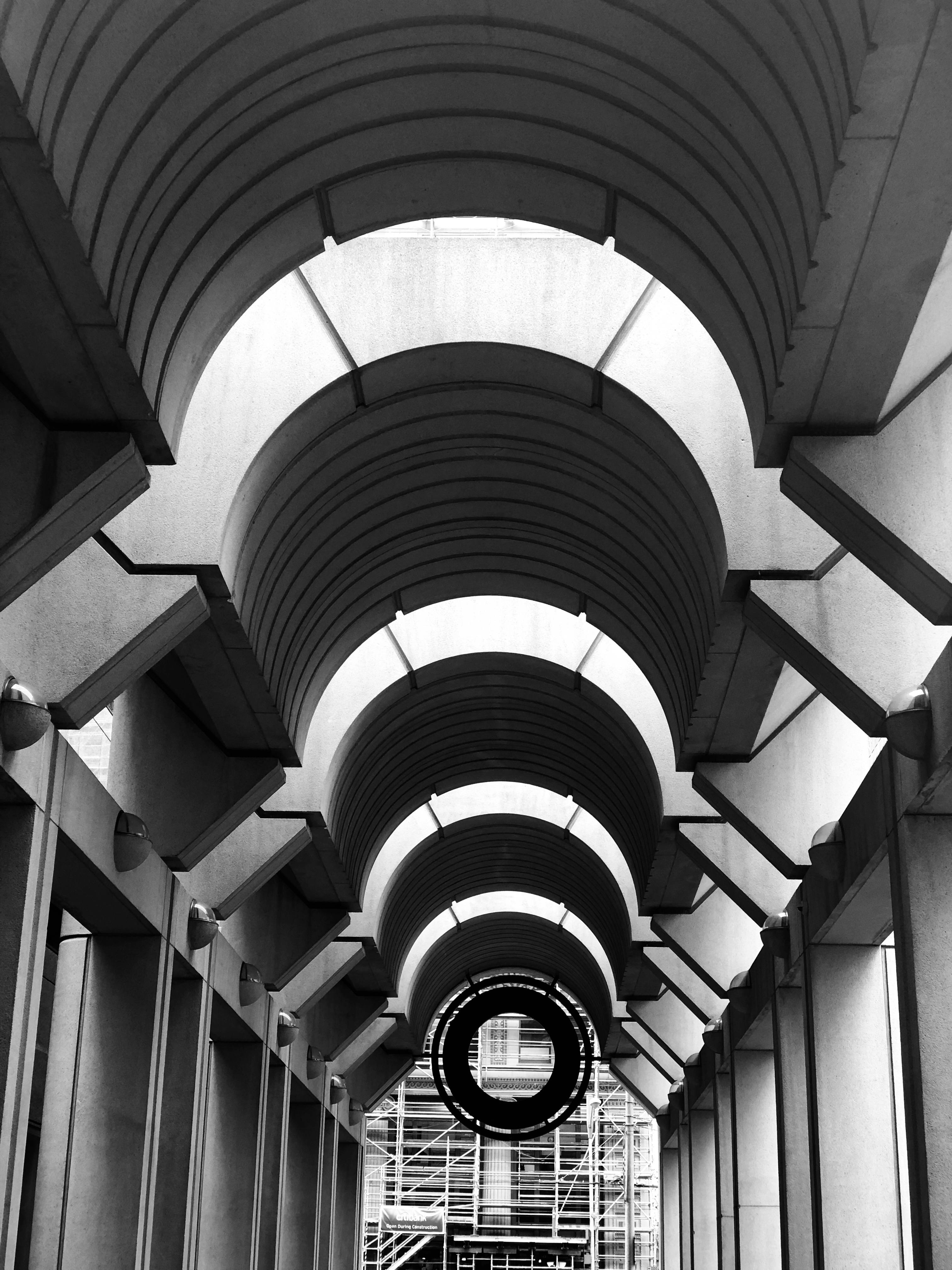
Example of Journal Entry:
While I was down in SanFrancisco during winter break my sister and I went downtown to do some sightseeing. We were walking to Embarcadero to go to Fisherman Warf and we walked by this building. It is the Federal Reserve Bank of San Fransisco. I took several pictures but I thought this would be the best representation of alignment. The arches and pillars are aligned to the front door, which is aligned with the park area in front of the building which you cannot see. My sister is the one who pointed out that this would be a good picture for my photography example and I must say she is right.
